colors-gradients-tesla-palette
title: Working with colors, gradients, and the Tesla palette excerpt: When to use solid vs gradient. How the studio's color picker works. The built-in Tesla paint colors and when to match them. tags: [colors, gradients, design-tools]
Color is the single biggest decision in any wrap design. Get the palette right and a simple geometric layout looks intentional. Get it wrong and the most elaborate design looks amateur. This is the working tutorial for the color tools in the studio.
Step 1: Open a design and find the color tool
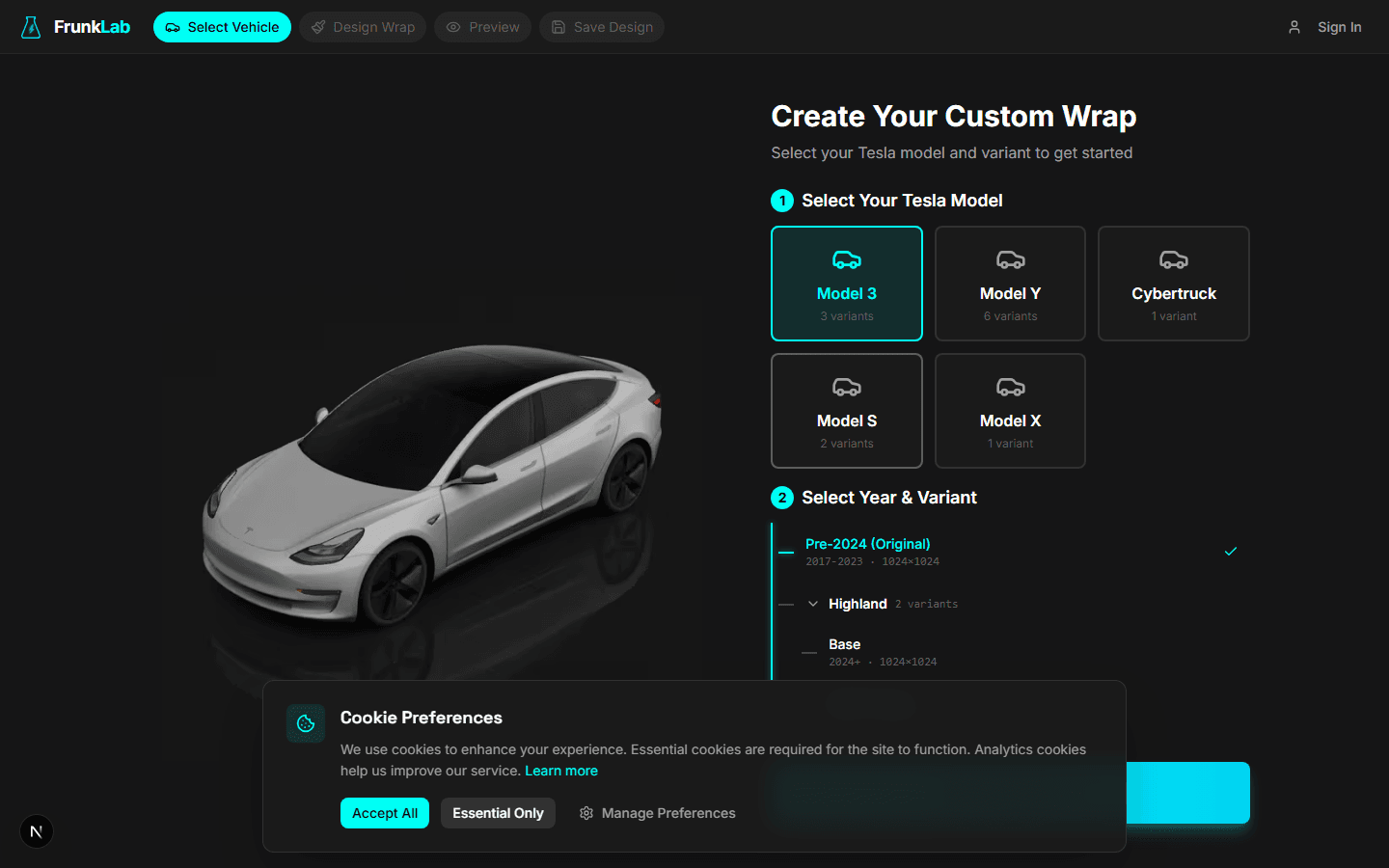
Start with any vehicle. The color tool lives in the left toolbar and applies to whatever's selected (background fill, a shape, a text element). If nothing's selected, it sets the global canvas background.
Three input modes: hex code (type any 6-char hex like #1A2B3C), visual picker (drag in the HSL gradient), and swatches (built-in Tesla paint colors plus common design palettes). Most users live in the swatches and visual picker. The hex input is for matching a reference exactly.
Step 2: Decide solid vs gradient
This is the meta-decision. Get it right before you start fiddling with specific colors.
Solid wins when the design is geometric (grids, tiles, racing stripes), the vehicle has flat panels (Cybertruck especially, where gradients band weirdly), the aesthetic is retro, or you want maximum legibility at the small in-car display size. Solid Pearl White on a Model 3 Highland with one Stealth Grey accent stripe is a wrap that will look intentional a year from now.
Gradient wins when the aesthetic is modern, soft, or atmospheric (sunsets, auroras, vaporwave), the vehicle has curves (Model 3 and Model Y, where the curvature softens gradient bands), or you're mimicking a sky, water, or metallic finish. A vertical teal-to-purple aurora gradient on a Highland Model 3 turns heads in the gallery every time.
When in doubt, solid. The failure mode of "solid color, wrong color" is boring but harmless. The failure mode of "gradient, wrong gradient" is muddy and amateur. A boring solid base can be saved with one good accent.
Step 3: Use the Tesla palette when you want to match the car
The studio's built-in Tesla paint swatches:
- Pearl White Multi-Coat. The factory pearl white.
- Solid Black. Factory non-metallic black.
- Midnight Silver Metallic. Factory gray-silver.
- Deep Blue Metallic. Factory blue.
- Red Multi-Coat. Factory red.
- Stealth Grey. The newer matte-ish dark gray on Cybertruck and select Model 3/Y trims.
These swatches are calibrated to match what Tesla's own renders use. Reach for them when you want the wrap to "match" your car's real exterior paint (wrap a Pearl White Model 3 in Pearl White and the in-dash illustration becomes a slightly cleaner version of the real car), when you want a familiar baseline, or when you're building a two-tone wrap and want one panel to feel stock. A Solid Black hood with a custom-color body is a classic two-tone treatment that lands instantly because half the palette is already calibrated.
Sample anything yourself outside the palette and it will read as "designed" rather than "factory." Both are valid; they're just different choices.
Step 4: Sample a color from a reference image
The most common color-matching workflow: you've uploaded a reference image and want a solid fill that matches one of its colors.
The color picker has an eyedropper. Click it, then click the pixel in your reference whose color you want. The picker captures the exact hex.
Two tips. Sample 3-4 pixels from different parts of the same "color" and pick the median, because a single pixel in a photo is noisier than the color your eye perceives. Then drop the saturation 10-15% in the picker before applying, because photo colors are typically more saturated than wrap colors should be. A red apple at #C42929 is fine in a photo and goes neon when stamped flat across a car door.
Step 5: Adjust for the saturation-on-3D-render reality
The 2D editor's lighting is bright and flat. The 3D preview applies directional lighting with highlights and shadows. The same color renders noticeably duller in the 3D preview than in the editor.
This isn't a bug. Real cars under real lighting have shadows too. The 3D preview is closer to what your car's in-dash illustration actually shows. Three practical implications:
- Pick colors slightly more saturated than you think you want. Push saturation 10-15% higher in the editor than the "perfect" 2D look, and the 3D render lands where you wanted.
- Avoid 100% saturation hex codes. Pure
#FF0000red goes neon in 3D. Use#D22929or#C42626for a believable car red. - Lightness matters as much as saturation. Car paint sits in the 30-50% lightness range. Cooler colors (blues, greens) read better at 25-40%. Warmer colors (reds, oranges) read better at 40-55%. Outside these ranges, colors stop reading as "car paint" and start reading as "highlighter."
The 3D preview is the source of truth. Trust it over the editor when they disagree. For the full QA workflow, see using the 3D preview.
Common color mistakes (and the fix)
Design looks great in the editor, washed out in the 3D preview. You used colors that look good under flat lighting. Push saturation up 10-15% and re-preview.
Wrap reads as one color from a distance. Your accent is too close in lightness to your base. If their L values are within 10 points of each other, the eye reads them as similar. Push the accent 15+ points lighter or darker.
Gradient looks like distinct bands instead of a smooth fade. Either the two colors are too far apart in hue (the transition has to pass through intermediate hues that read as bands), or your gradient is spanning a small surface area. Pick closer hues, or expand the gradient across a larger portion of the body.
On palettes with more than two colors
Most successful wraps in the gallery use two or three colors. Four is the upper limit before things feel busy. Five or more rarely works unless one is doing very specific accent work.
If you've picked four colors and the design feels off, the fix is usually to drop one, not to add a fifth.
The Tesla wrap color guide covers palette psychology per vehicle in more depth. The shortcut rule: fewer colors than you think you need, calibrated against the 3D render, with the design doing the work.
Open the studio and try a two-color wrap first.
Ready to design your own?
Open the studio